Sustainability VR Mapping System & Bin Locator
UX/UI Design
UC Berkeley Spring 2023
User Experience Design
Faculty Luke Easterwood
PROJECT DETAILS
TEAM
Vanessa Atkinson
Niti Thakar
Steven Tan
Peggy Zhou
Elise Metcalf
Product Designer
UX Research
Interaction Design
Visual Design
Prototyping
Testing
ROLE
TOOLS
Figma
Miro
Invision
Trello
Adobe Creative
DURATION
3 Months
January - March 2023
Overview.
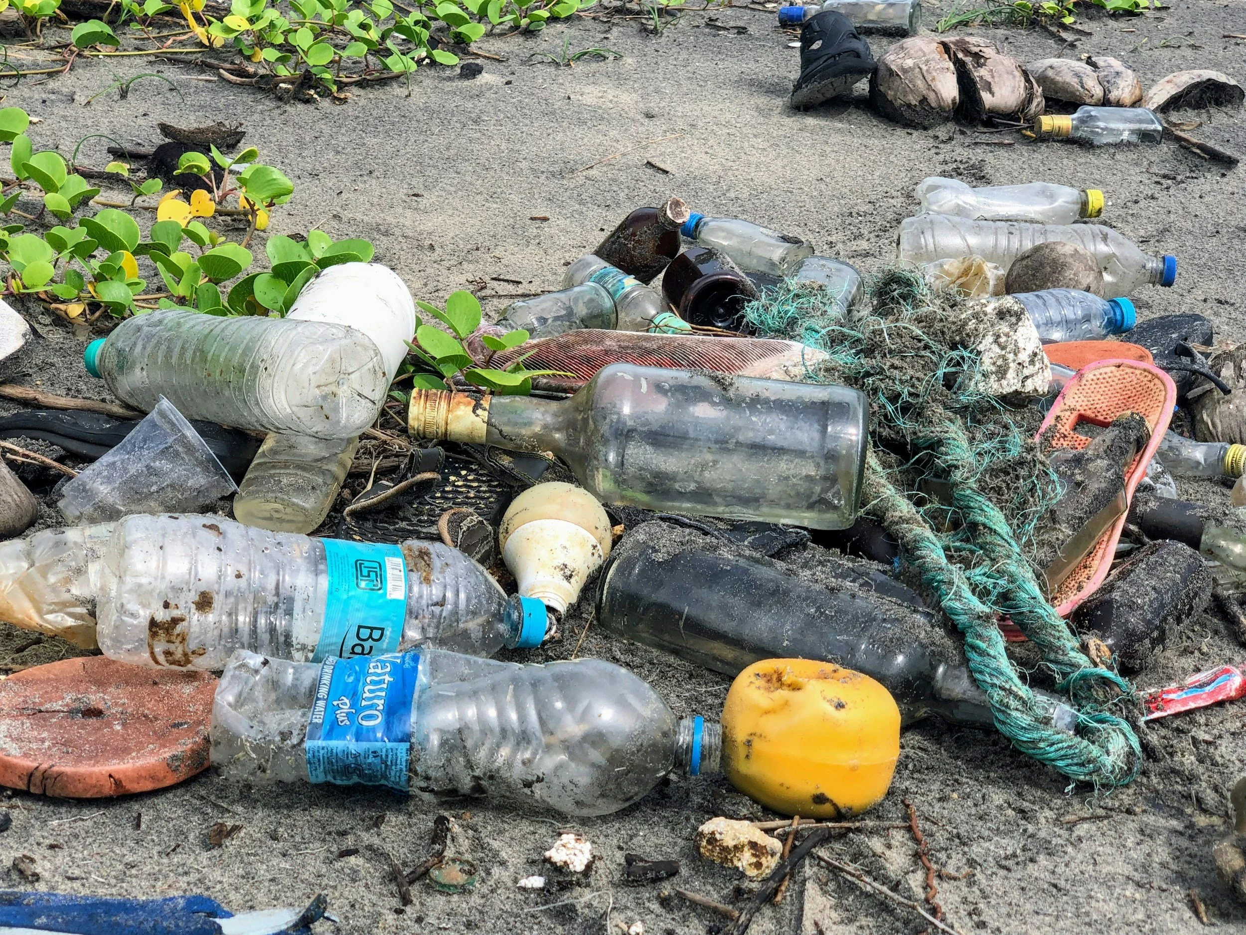
Lack of knowledge about proper garbage disposal leads to trash being improperly discarded, scattering into neighborhoods, cities, and oceans, causing environmental concerns about the negative impact of pollution.
The Challenge
Trying to increase public awareness about proper waste disposal methods. Without targeted education, trash will continue to be improperly discarded, contributing to pollution in neighborhoods, cities, and oceans.
Your Ultimate Companion In Sustainable Living, Empowering You To Make Impactful Environmental Choices.
Key Features
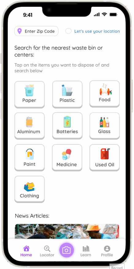
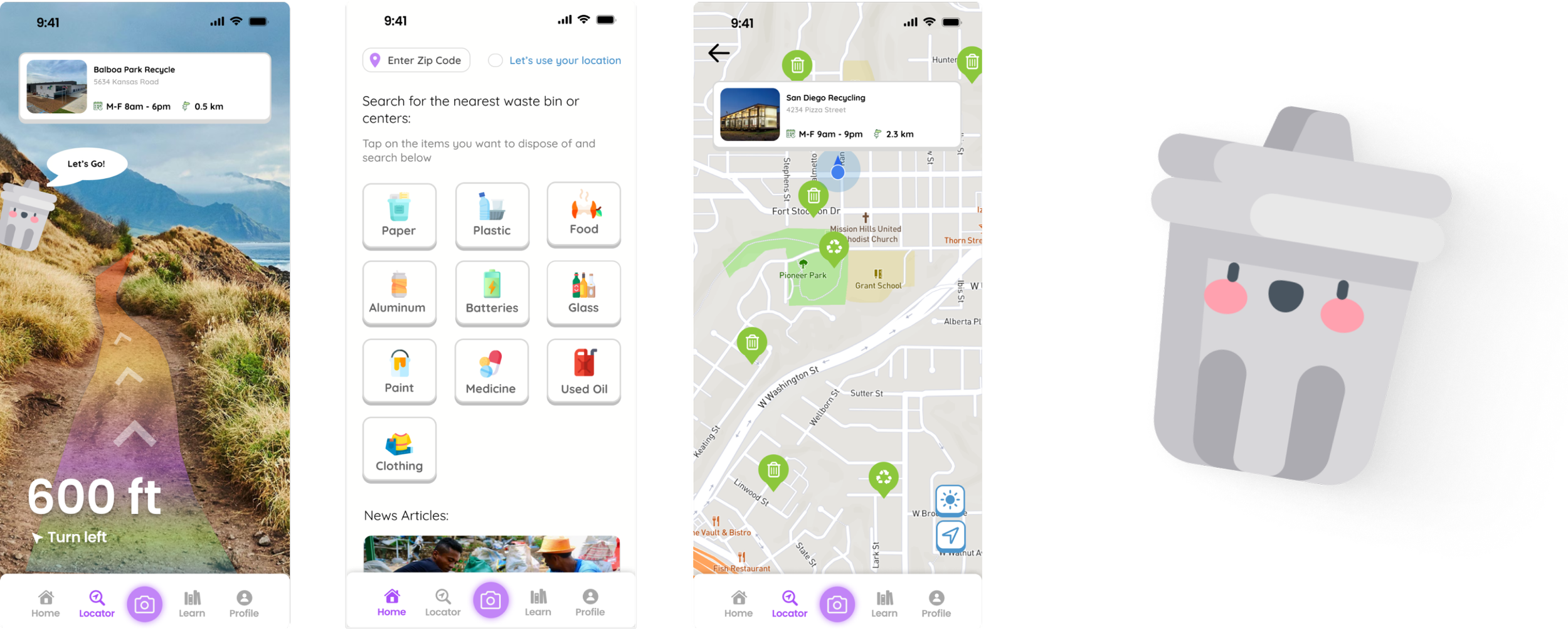
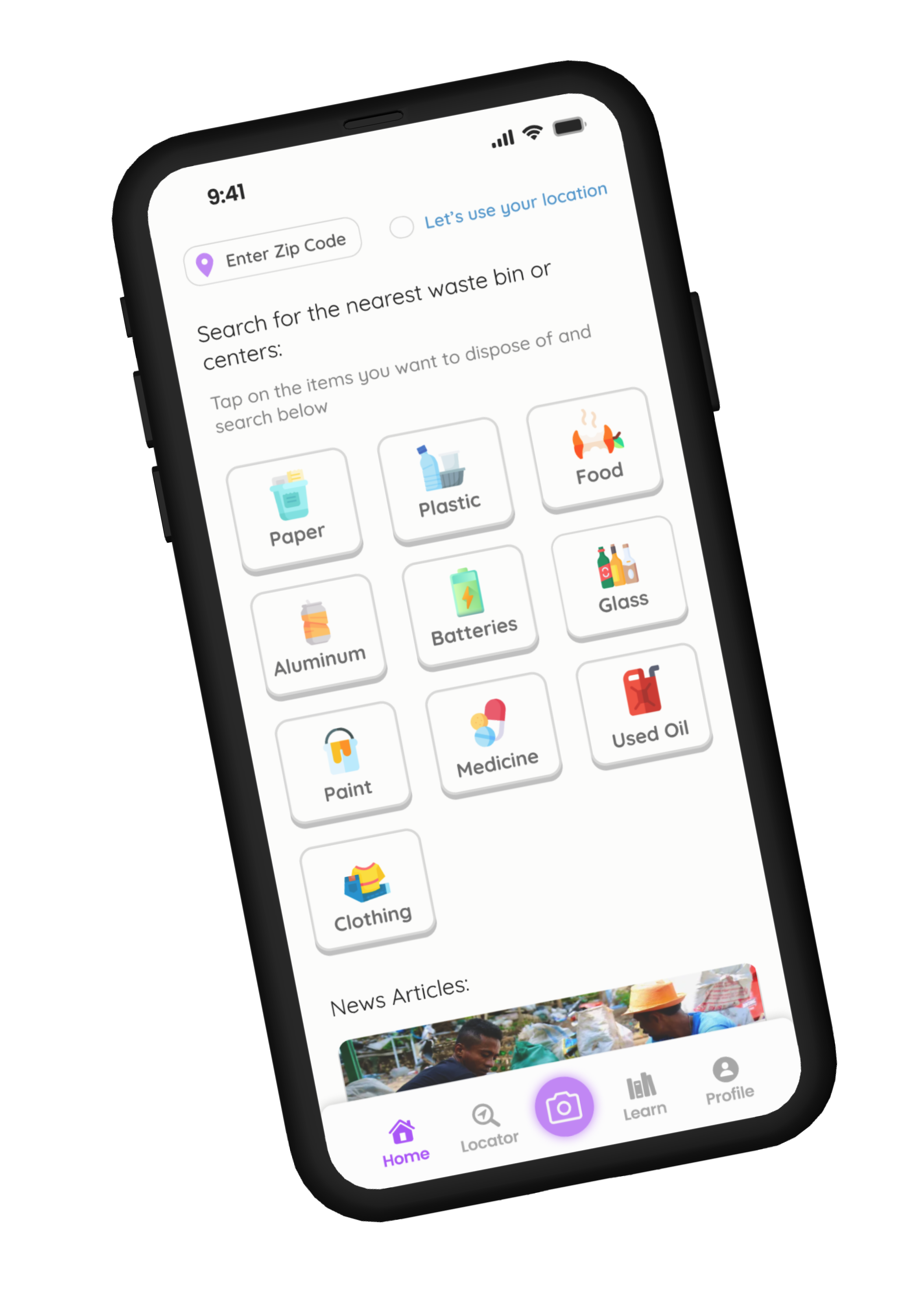
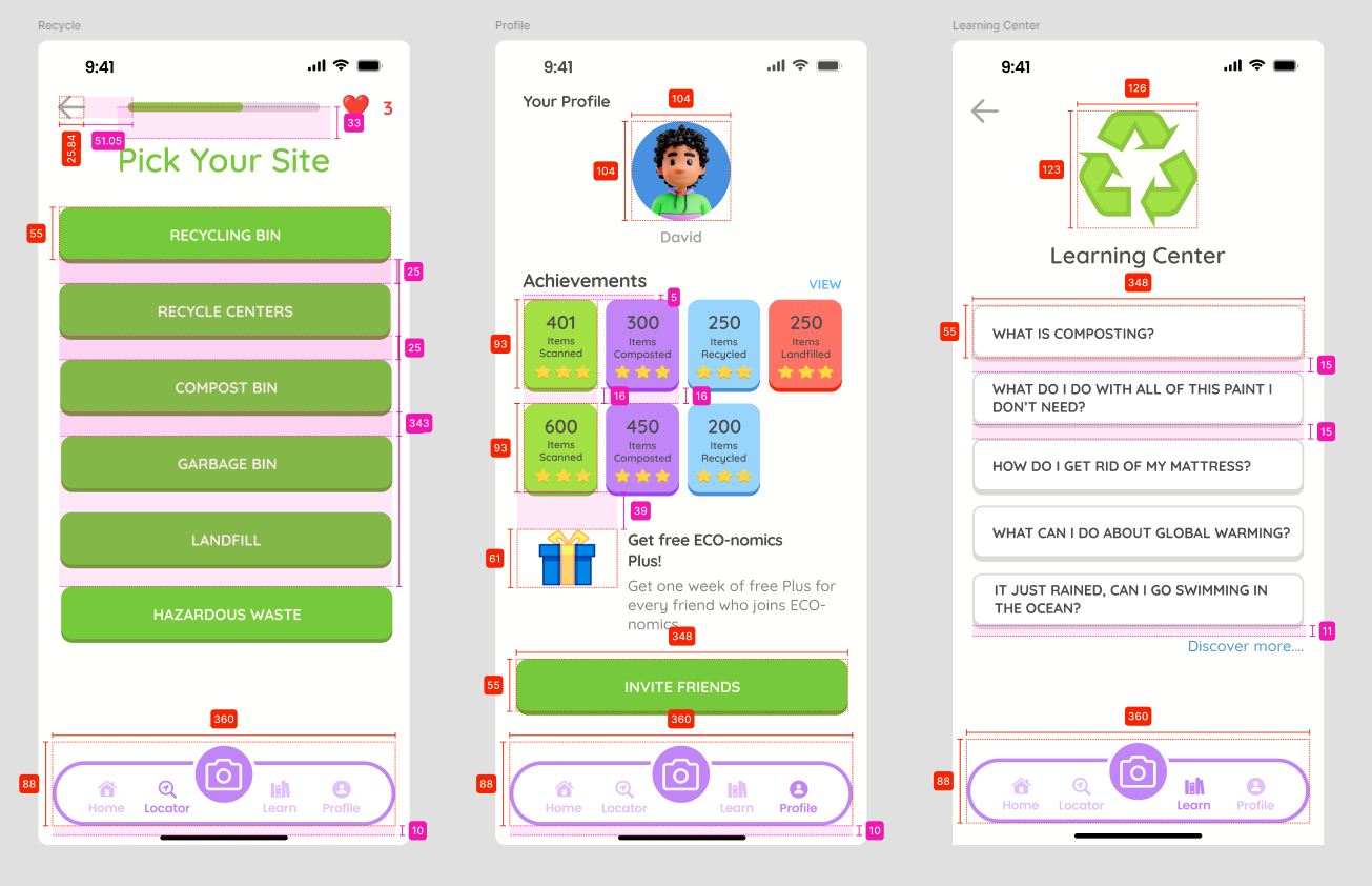
Allowing users to quickly and easily find the nearest appropriate bin, simplifying waste disposal and encouraging proper sorting.
Bin locator for waste disposal

Providing instant, clear instructions on how to properly dispose of items, making the recycling process intuitive and reducing confusion.
Item scanner for recycling guidance
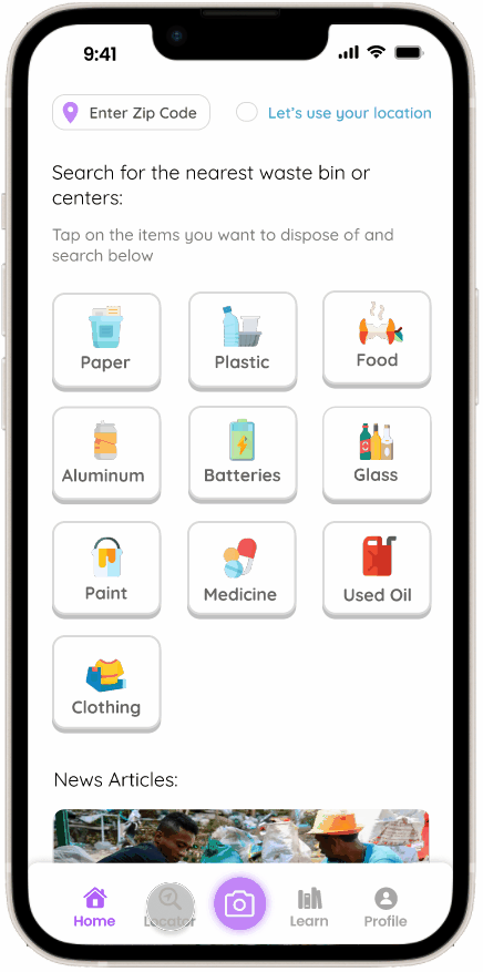
Offering an immersive, interactive way to navigate spaces, making it easier to understand complex environments intuitively.
VR mapping system
Stratigize
RESEARCH METHODS: Competitor analysis, user interviews, a survey, affinity mapping, story boarding
We identified 5 competitors.
Our competitors have a specific niche or functionality, and our focus is to have all eco-friendly needs met in one application.

Ailuna has a community that is small and relies on user truthfulness to collect data.

Recycle Coach has a community driven platform and if your city doesn’t have a big enough population, the app will not have information for the user.

iRecycle lacks updates and does not have an item identifier or information about what type of item you would like to dispose of.
Then, we conducted online survey with 10 questions to gain quantitative data and initial insights from users (18 participants). Our focus for the surveys were:
Demographic data
Eco-friendly behavior
Managing eco-friendly resources
Experience with general apps navigation


Findings:
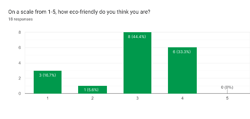
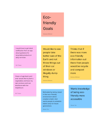
44 % of 18 participants believe themselves to be “somewhat” eco-friendly.
55% of participants have a want to either be more eco-friendly or want to have more resources to do so.
Next, we conducted five interviews to gain attitudinal and qualitative data. Our focus for our interviews was:
Managing eco-friendly resources
Eco-friendly behavior goals
Needs & pain points
Expectations for app
Findings:
Participants don’t use other eco-friendly applications because they havn’t found one that meets their needs and wants.
Participants want to see people take better care of the Earth and not throw thngs out of their car windowns or illegally dump.
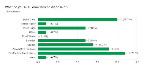
Participants don’t know where most trash should be put or their hazordous wastes such as batteries and paint.
Participants would recycle and compost more if there was a more eco-friendly application.
Our focus for the affinity mapping was:
Distill user needs & goals
Identify patterns & connections
Clear idea of pain points

Findings:
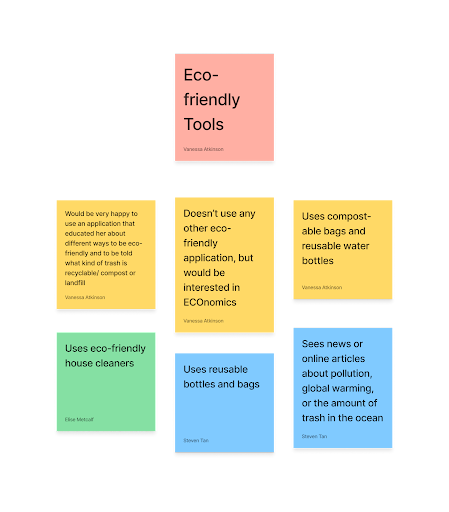
Users do not use any other eco-friendly app, but would be interested in using a quality one.
Users use compostable bags and reusable water bottles.
Users did not know where most trash should be put or their hazordous wastes such as batteries and paint.
Users are interested in having notifications to do more eco-friendly activities.
DESIGN METHODS: User flows, paper sketches, wireframes, usability tests, iterations, final prototype
Iterate
We were able to define a user flow for our usability tests.

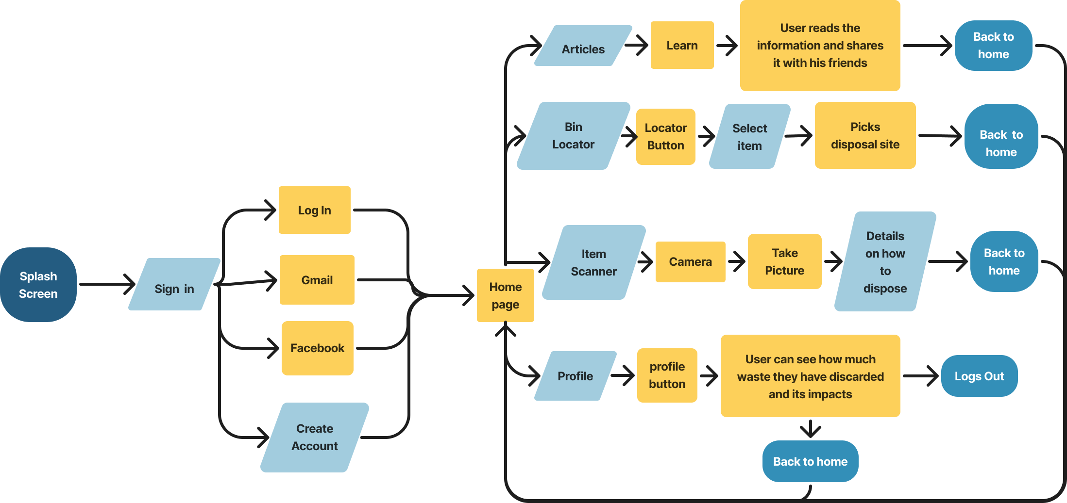
User Flow: Start-to-end
Task: Create an ECO-nomics account


Task: Find out how to dispose of an item using the item scanner
Task: Locate a trash bin or dispensary in your area

Through our wireframes, we prioritized user needs by integrating key features such as:
An item scanner for real-time identification of recyclability
A bin locator to find the nearest disposal facilities
VR Mapping System
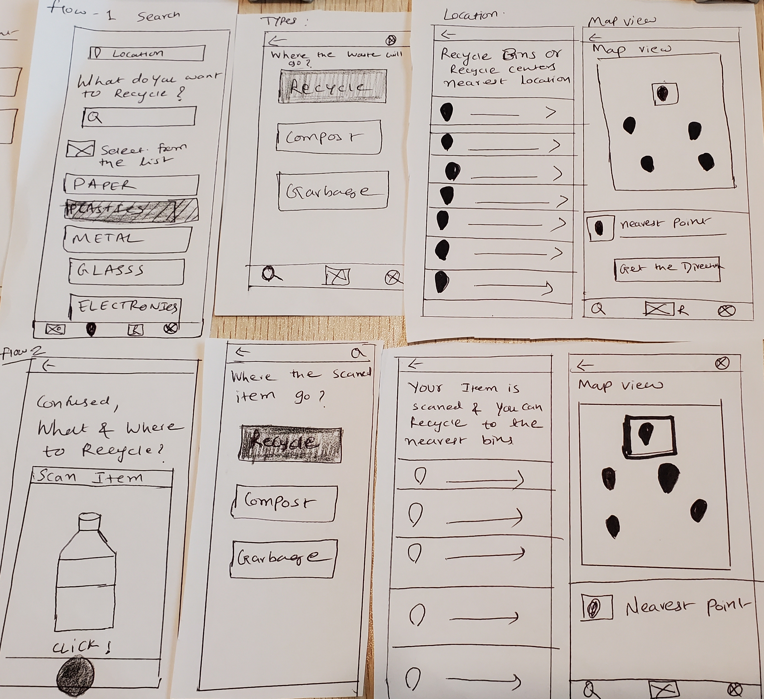


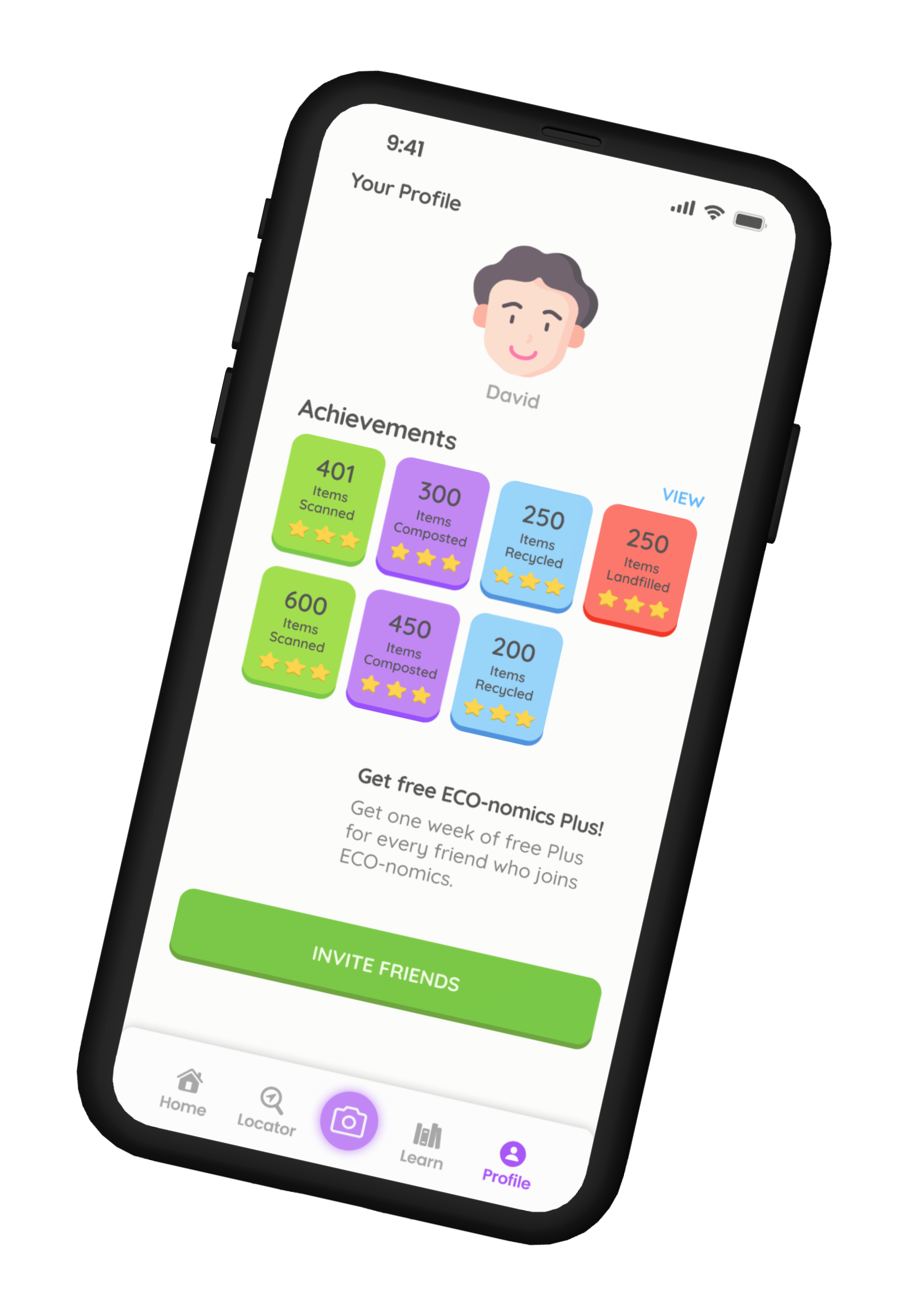
Conducting usability testing revealed a challenge in users locating the picture button, prompting a redesign to enhance visibility. The button was made more colorful, the icon was changed, and its size was increased for improved noticeability. Additionally, the home screen underwent improvements to enhance scanability, and a consistent blue gradient was added to all screens for visual coherence. The lower navigation bar was also refined for a clearer appearance, contributing to an enhanced overall user experience.
These features were designed to enhance user experience, align with environmental awareness and meet our users expectations and needs for this application. By seamlessly incorporating these functionalities, the app aims to provide users with practical tools and valuable information for sustainable living.
Launch
Measure
Integrating emerging sustainability standards into the mobile interface involved multiple research stages, including interviews and usability testing. Defining the target audience presented a challenge, requiring an in-depth exploration of diverse user characteristics, preferences, and expectations. This comprehensive approach, involving surveys and iterative research, was essential for informed design decisions. It ensured the final product aligns with user needs and evolving sustainability criteria, creating a user-centered design that caters to the intended audience's diverse preferences and needs.
If this application was launched I would be looking at conversion rates and looking to see people learning from this app and making a concious effort to be more eco-friendly.
Our team dove deeper into the process of UX/UI design and user research. We precisely researched and brainstormed to think of ways we can cater toward individuals who want to take action to be more eco-friendly. During our user research process, we discovered so many details that helped us iterate and create features based on our users’ needs. We designed an application using different hues of green to reflect an earthly aesthetic, but also kept shades of black and white to contrast important elements.