
UX/UI Design
Non-profit Website Redesign
Vanessa Atkinson
Christopher Taconi
Joyce Chen
Maria Roukoz
Sreelu Reedy
Team
UX/UI Designer UX Research
UI Design
Interaction Design
Prototyping
Testing
Project Details
Role
User Experience Design
Volunteer Project
Tools
Figma
Adobe Creative Suite
InVision
Mirro
Trello
Duration
3 Months
March - May 2023
Overview.
A journey into business growth. The non-profit organization Beyond Hunger focuses on preventing eating disorders and promoting body positivity among middle and high school students. Website remained unchanged for the past six years.
The Challenge
Enhancing functionality and ensuring seamless consistency to foster organic company growth.


The first thing we wanted to do was to scan the original layout and flow so that we could get a better feel for the needed improvments. Several opportunities were identified through competetor analysis and heuristic evaluation to enhance the user experience.
All pages remained identical
Text updated on each page as the user navigated through the website.
Lack of clear user flows.
Lack of call-to-actions (CTA).
Market research and benchmarks
Original Desktop Home Screen
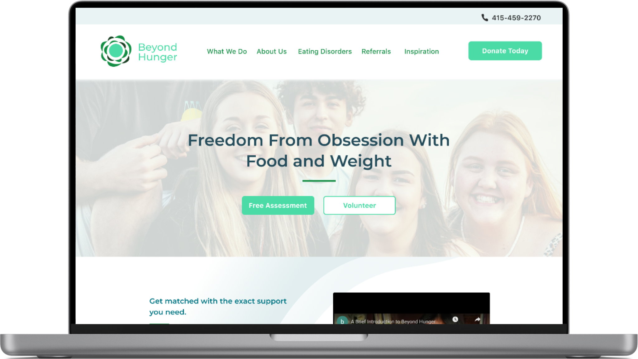
Redesigned Desktop Home Screen


Competitor Analysis
To try to get an understanding about the market and tends in the eating disorder helpline industry, we researched potential competitors, direct and indirect. Below are the key insights taken from our evaluation of each competitors desktop site.

Direct Competitor:
Allows for live chat
7 locations
Gold Seal of Approval for its services
Costly service

Direct Competitor:
Allows for live chat
Cross continental
Very organized website layout
Costly service

Indirect Competitor:
Strong information architecture
Attractice interface
Easy to understand navigation
No program for eating disorders
Top Three Insights from Stakeholder

1
Website needs forms for requesting presentations and volunteering applications.
2
Website needs a calm and minimalist website design.
3
Website needs a clear indication on how to donate to our cause.
User Expectations
Janice W.
“As a user, I need to see a clear purpose of this website and logical flow of each action I take.”
George R.
“The top navigation bar needs to be less crowded to improve my experience on the site.”
Lance G.
“I am noticing large blocks of texts that should be avoided becuase it causes me to feel overwhelmed.”
Lacked Purpose
Challenging
Crowded
Overwhelmed
Frustrated
To visually depict various user scenarios, interactions, and pathways a storyboard was created. It helped in understanding and empathizing with the users' experiences, identifying potential challenges or triggers, and ensuring that the design addressed the sensitive nature of the content while providing a supportive and user-friendly environment for individuals seeking information or assistance with eating disorders.
Storyboard


User Flow
Based on our research, we ideated the initial wireframes for the Beyond Hunger website through sketching:
aligning design with user needs.
facilitating rapid exploration of layout and features.
Informed by iterative feedback.
cohesive and intuitive blueprint.
foundation for subsequent design stages.
Meeting Needs and Expectations

Design System
I created this design system for Beyond Hunger website redesign in order to provide a consistent and cohesive visual language and user experience across various elements of this project, ensuring a unified and professional appearance. This systematic approach also streamlines the design and development process, enhances collaboration among team members, and facilitates future scalability and maintenance of the project by establishing standardized components, styles, and guidelines. We integrated the color green from their original logo and added a secondary purple color which was inspired from the northern lights colors that make up a beautiful, calming combination.

Iterations
In the iterative process of the website redesign for Beyond Hunger, several enhancements were implemented after gaining insight from our usability testing:
The hero image was updated to emphasize the business purpose, creating a more impactful visual narrative.
Colors were strategically adjusted to accentuate crucial information on the screen, fostering better user comprehension.
Testimonials were transformed into a carousel format for an engaging and streamlined user experience.
A new vibrant and diverse brand identity was crafted to encapsulate the spirit of the youth served by Beyond Hunger, contributing to a more cohesive and compelling online presence.

Challenges and Next Steps
20% increase in the conversion rate for visitors donations
25% increase in engagement with educational content on the website
While redesigning Beyond Hunger's website and crafting a mobile interface, challenges arose in effectively conveying Beyond Hunger's mission while ensuring a user-friendly experience, particularly for diverse users. Our goal was to achieve accessibility and inclusivity with careful consideration to deliver a seamless experience, staying aligned with Beyond Hunger's business objectives. These challenges around ambiguity, were overcome with our Stakeholder interview and clarifying meetings.
The final iteration of our prototype, a culmination of iterative design and user testing cycles, provided validation of our design choices as all participants successfully accomplished assigned tasks. This positive outcome reinforced our confidence in the usability and functionality of the final product, ensuring it stayed on track with Beyond Hunger's overarching business goals. There is always room for more iterations with further testing.

